POC: DueDil's new mobile experience for users on the go.
DueDil is a B2B SASS company with the vision 'Tell the story behind every business', providing a comprehensive view of private company information and the people that run them.

At DueDil, we are given 10% of our working time to work on a side project. I used mine to explore how we could improve DueDil's mobile experience for users on the go.
Question: How can we improve DueDil for users on the go?
Mobile user data
I spent some time anaylising data collected from Duedil traffic and discovered that around 36% of our users view our platform from mobile devices. Of that 36% only 12% of those mobile users were logged into the platform (logged in users are our customers or potential prospects). I decided to focus on the 12% as these users were more likely to bring revenue to our business. I wanted to optimize their experience and better understand what they are trying to do with the platform while on the go.
Looking at the most common activities performed on mobile devices, I discovered the top most commonly viewed pages were: Company profile (1,345 views per month), Director profile (864 views per month) and the Quick search feature (1,032), with viewed list (saved /previous views). After synthesising these figures I started to form use cases to explore further.
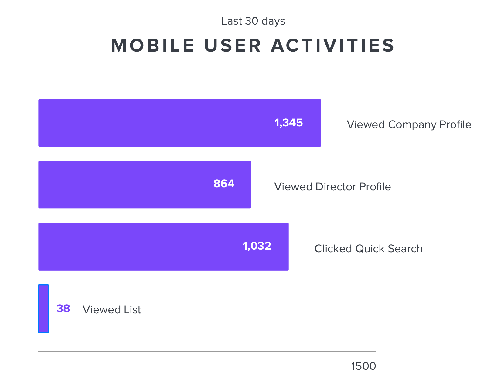
Above image: Mobile user activity figures.
Use case
The data suggested that sales and prospecting could be the most common use case for users on mobile. They wanted to quickly find out about companies and directors they are interested in.
Sales & Prospecting Ideas
I came up with ideas that I wanted to test with sales and prospecting use cases.
- Quick search for companies / directors
- See companies near me
- Who's in my calendar import contacts
Sketches / wireframes
Now that I had a clear direction for the prototype, I started with some rapid sketeches to get all my ideas down on paper, exploring how and where the search would best fit. I went broad with ideas to get all ideas down, then went deeper with the more viable concpets thinking about how filters would behave and how user searches could be used to personalise their expereinces over time.
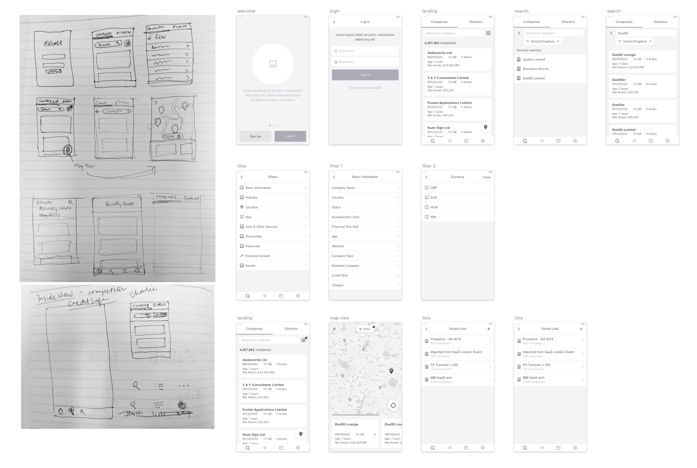
Above image: Prototype wireframes
Prototype
Focusing on the most common use case - finding companies and directors, I made the search experience prominent on the first screen. Users are immediately shown the most common filters they can use to run search. They are also able see their search results in a map view to easily see what other companies are near by. Users can also sync their in app calendar to easily see what companies may be attending an event they are on the way to attend.
Above: Click through prototye
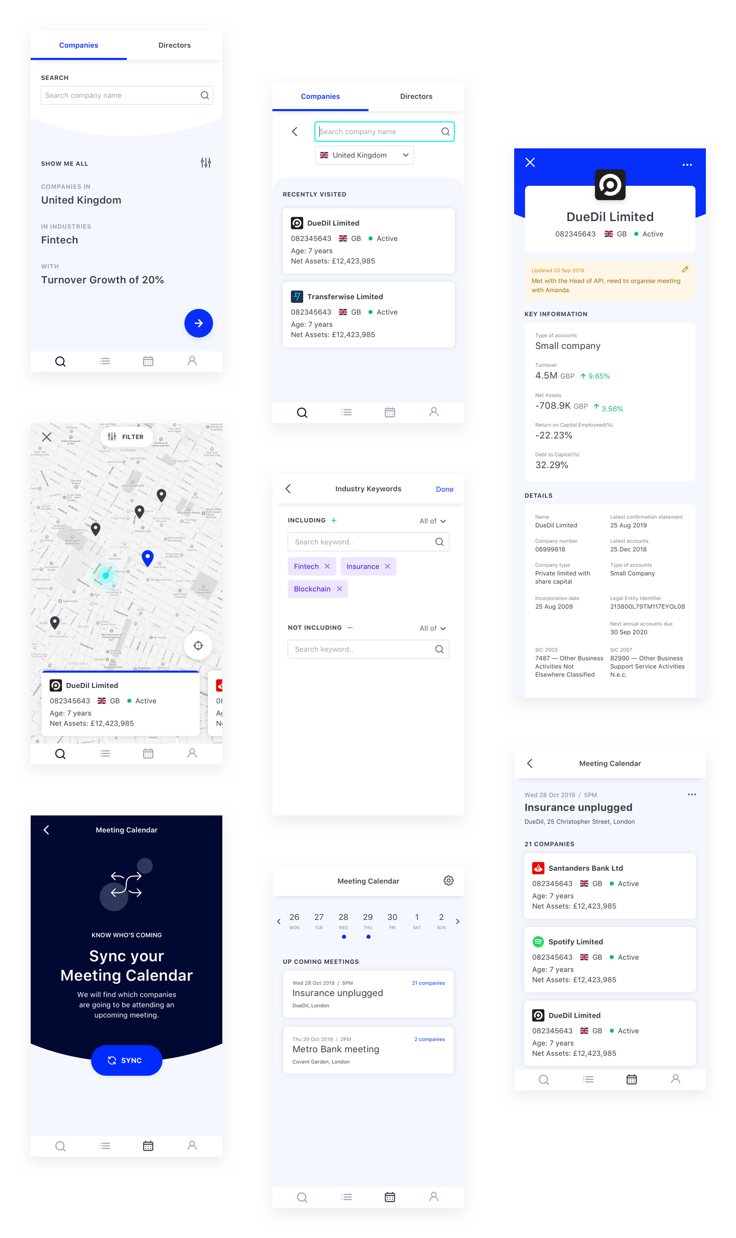
Above image: Parts of prototype
What next
I presented my work back to the wider company, outlining the process and findings of my work and recieved huge praise and postive feedback. The next steps are to run user testing with our customers and get further validatation of my hypothesis. This project has created awareness within the company about the mobile experience and is only just the start in improving our mobile user experience and will require continuous efforts to cater for our growing number of mobile users.