Creating a Design System for DueDil, a B2B SasS company.
DueDil is a B2B SASS company with the vision 'Tell the story behind every business', providing a comprehensive view of private company information and the people that run them.
With a design team of three, we created a Design System for the web application.
The Problem
DueDil's web application had an ongoing challenge of implementing any changes to the product resulting in inconsistency and bugs. It consisted of bad UX patterns and accessibility issues. It's legacy code was outdated and hacky and was causing major problems when trying to develop new features.
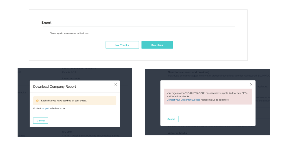
Above image: Three different UI for when user ran out of download quota.
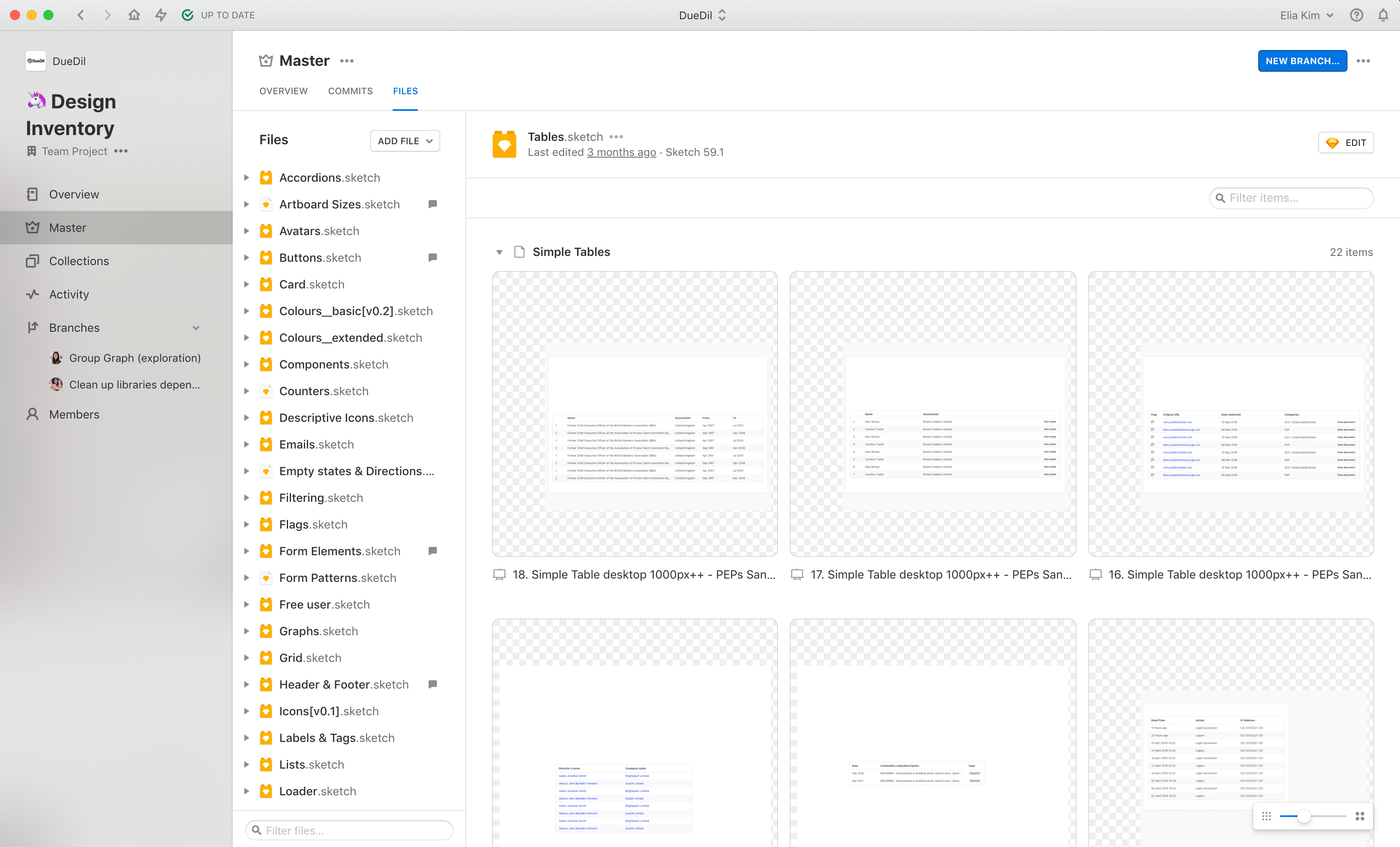
The Project
The Product and Engineering team decided it was time to modernise the system. With it introduce new design patterns to improve the accessibility and consistency - the DueDil Design System. The Design System was to accelerate our design and development speed by componentizing the UI.
Design Principles
First, we needed to define what our design principles would be. These words would be reflective of what we believe the company and the values in which we design the products. We ran and facilitated surveys and workshops throughout the company engaging with key stakeholders. Identifying what resonated with us as a business thinking about our products, values and culture we ranked them using Maslow's hierarchy of needs.
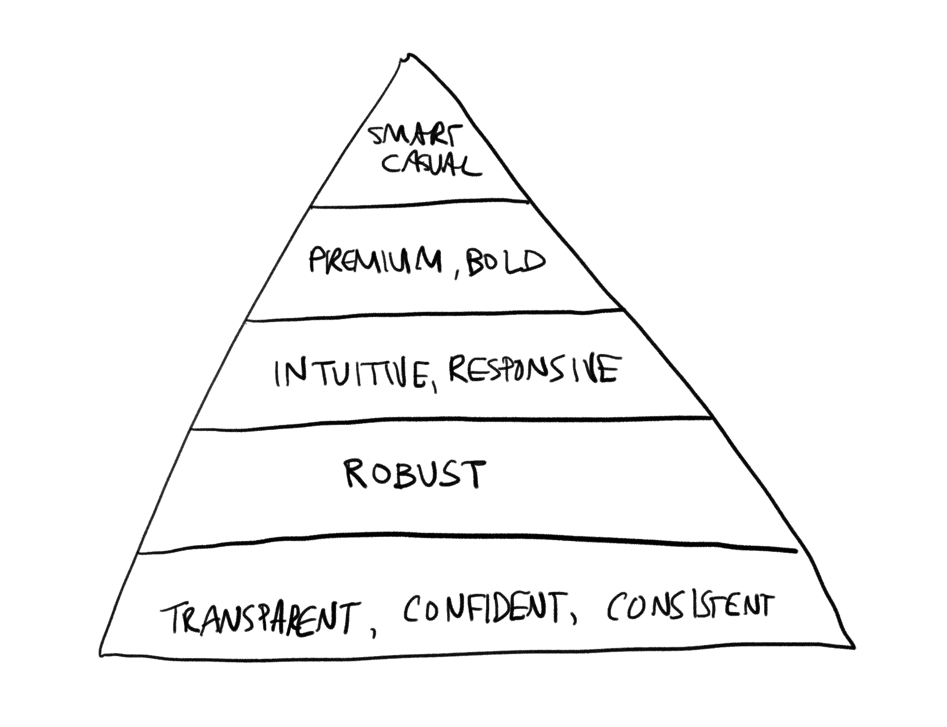
Above image: Design principles
Tools
We studied other Design Systems and researched what could be a suitable setup and tools we could use. We decided to use Abstract to build and manage our design library. Abstract has version controlling capabilities and the ability to share Sketch library files across multiple projects. It also allowed us to collaborate effectively and review and approve each others work.
Colour Accessibility
We knew early on that our current primary call to action colour, teal, was not passing our new accessibility goals when it was combined with white text or used as a primary text colour itself.
Knowing that we wanted to choose a colour that would be versatile and work well as text as well as background with white text. We explored different colours with mood boards, experimenting with different colour combinations and accessibility tests to agree on a colour that we would evolve throughout the design system.
Above image: Colour accessibility tests, red bar signals fail, green bar signals pass.
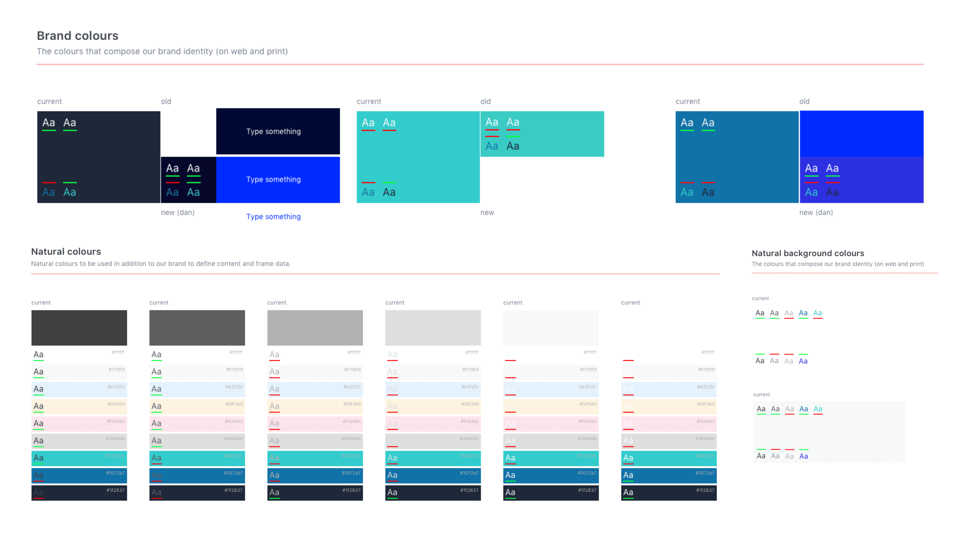
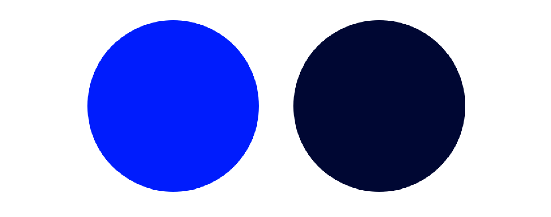
New Colours
We chose a vibrant colour pallette with a hint of saturation to modernise our brand. The dark navy as the main brand colour, and the blue as our interaction colour. DueDil already had existing secondary colours, they just needed some adjustments to the saturation level in order to align with our new blue and navy. And then we had our colour pallette.
Above image: Primary colours
Above image: Secondary colours
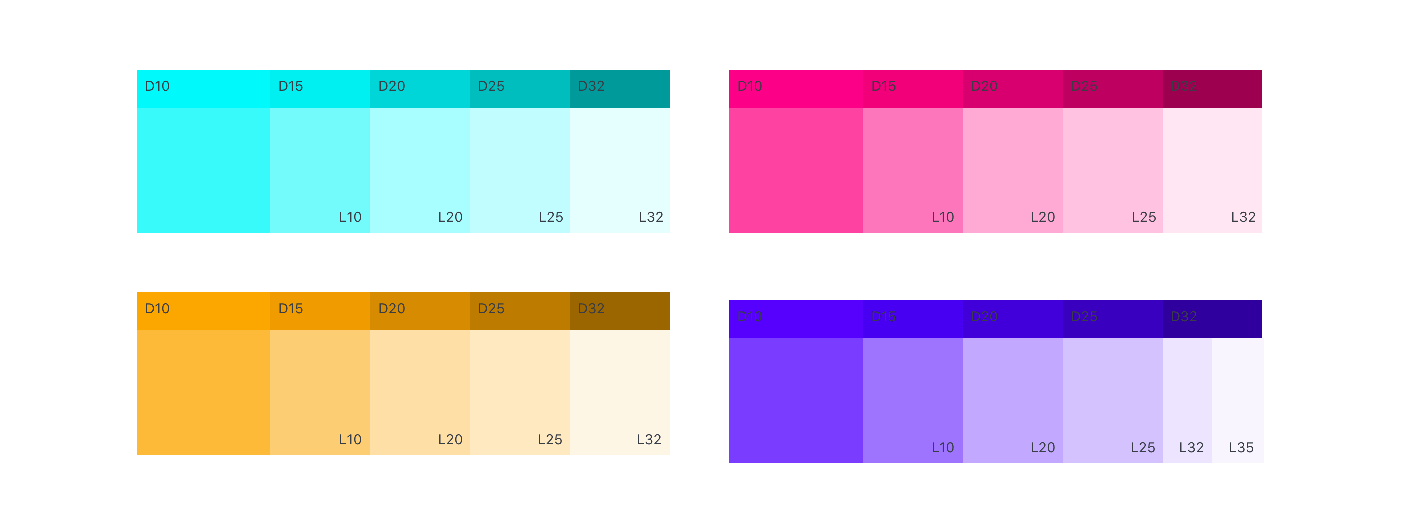
Establishing Depth
DueDil is a data heavy platform that has many levels of information hierarchy. In order to help group these levels more effectively, I used the different tones of backgound colours to create a z-index to the layers.
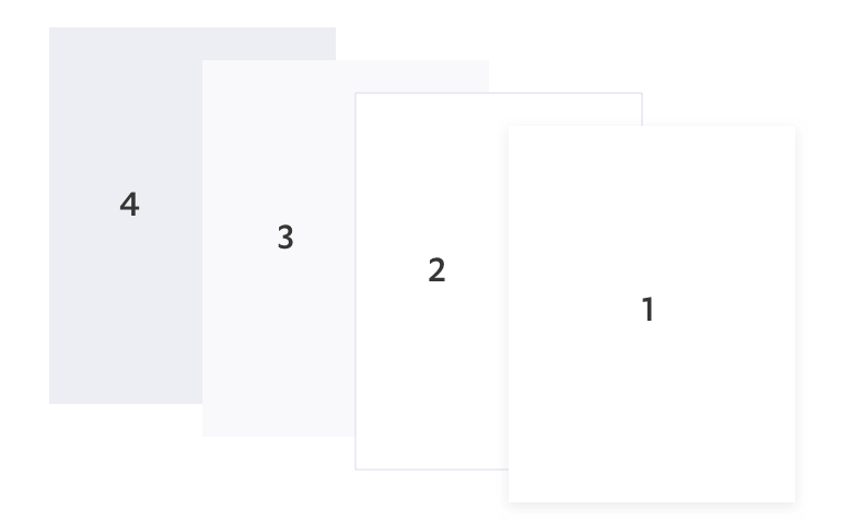
Above image: Depth colours
Typography
To ensure a native experience to all our users, we decided to use system fonts. We established typography rules, defining font-sizes, font-weights and line-heights depending on it's use case.
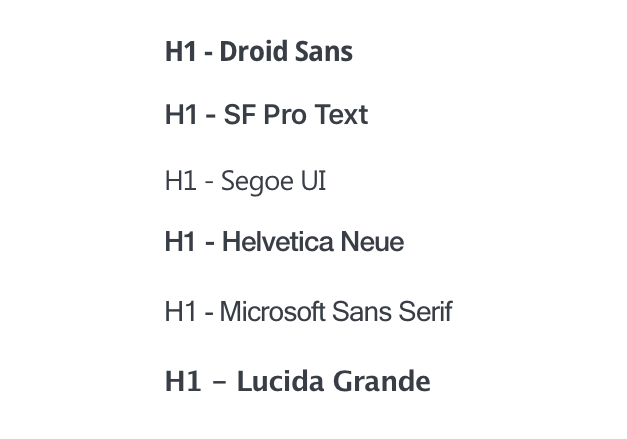
Above image: Example OS default typography
Grid & Vertical Rhythm
We defined our vertical and horizontal spacing rules in 4px units. Having all spacings in multiples of 4px ensured a harmonious layout and consistency across all browser sizes.
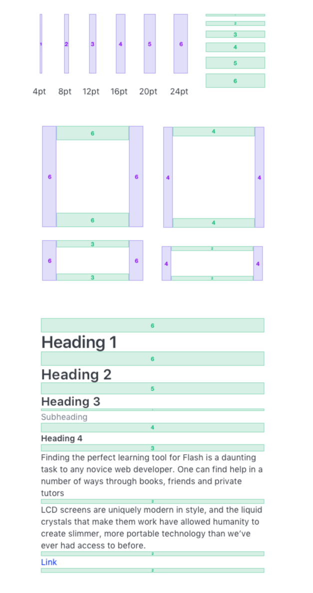
Above image: Vertical Rhythm
Atoms, Molecules, Compounds
As we started planning how we would create a Design System, we needed a way to structure the elements. It needed to be flexible and scalable. We decided to structure these elements into three groups:
- Atoms - eg. buttons, icons, avatars
- Molecules - eg. cards, graphs, filters
- Compounds - eg. login form, sidebar
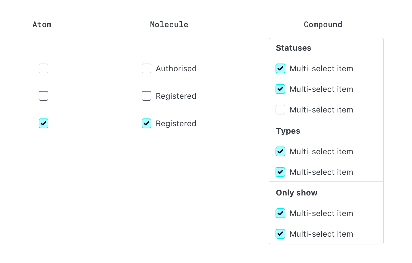
Above image: Checkbox 'elements' example
Above image: Part of molecule designs - buttons
Above image: Part of compound designs - slats
User Testing
We created prototypes to test some of the functional changes that were introduced, like the placement of the navigation and the quick search. We ran testing sessions with our customers and free users. This allowed us to validate some of our assumptions and also iterate according to the test results.
Designs
After designing majority of the elements of the web app, we started assembling them together in to pages, making amends to the elements as we went along, discovering new challenges that needed addressing.
Example - Design System applied to Dashboard:
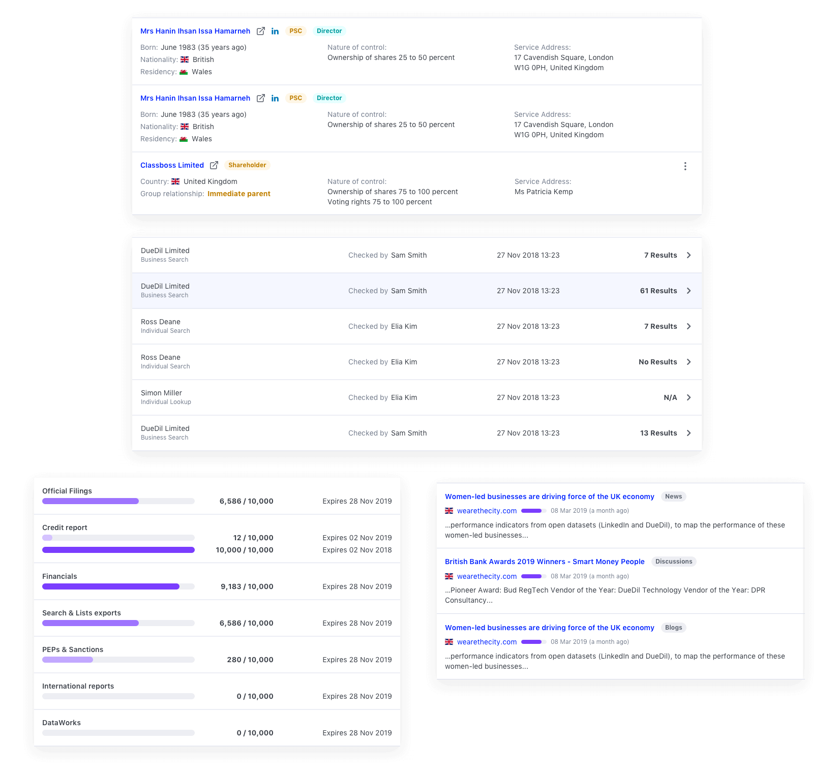
- Depth colours to show hierarchy of content
- Navigation repositioned and style changes, smaller top nav increased page space, reduced side navigation real estate
- Search function reduced to increase space for content
- Grid system and rules introduced, improved visual heirarchy and structure to the page
- New accessible brand colours
Above image: Old dashboard
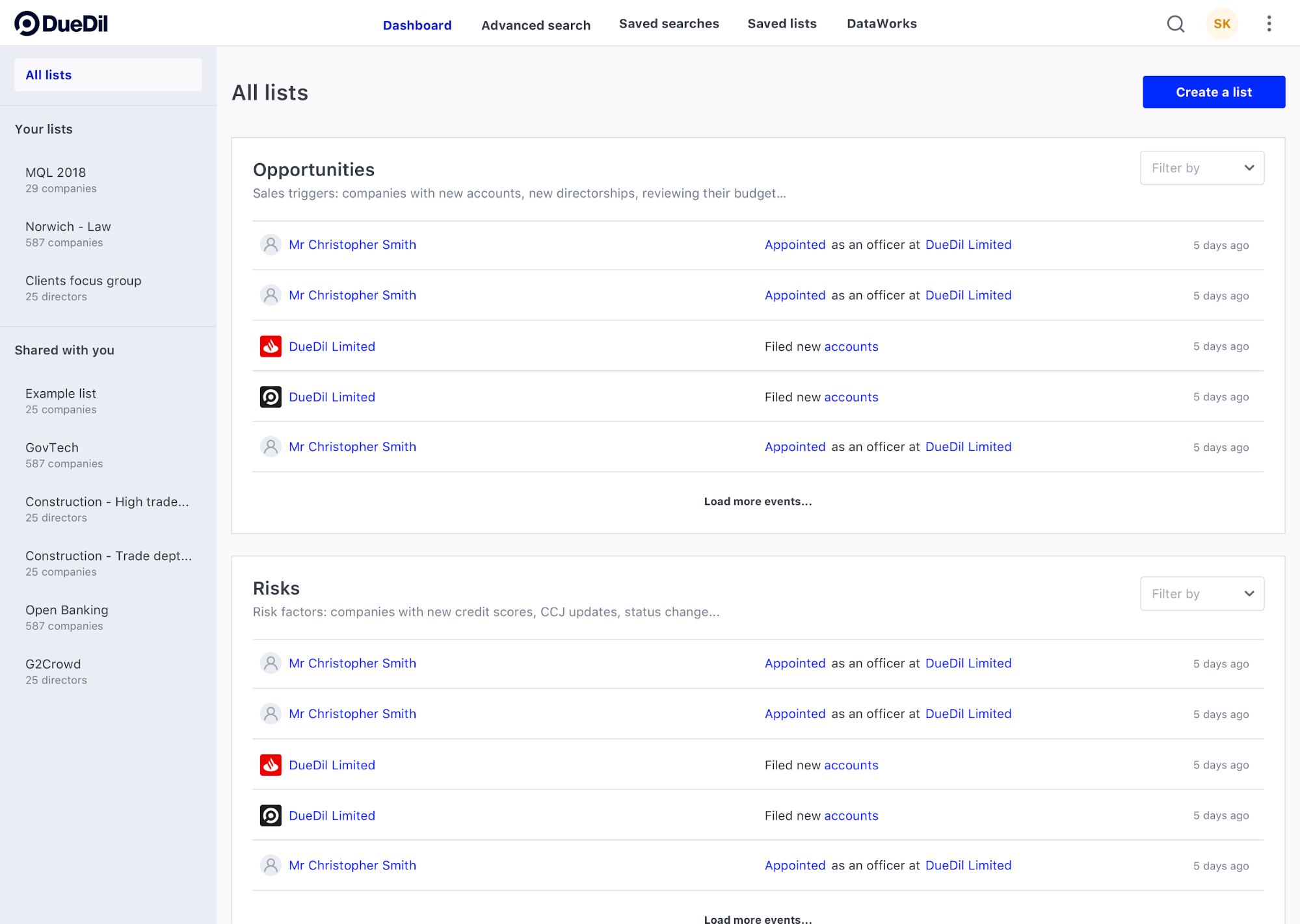
Above image: New dashboard
Data Visualisation
DueDil is a data heavy platform and data visualisation is key. This is one of the most exciting parts of the product as it provides meaningful insights to our customers in a easy to understand visuals. I explored the different colour combinations for all of our graphs. For example, our old group graph was difficult to understand as it used one colour in different tones to represent the company relationships. So for our Group graphs, I used warmer colours to represent parent companies, and cooler colours to represent subsidiary companies, providing a clear visual divide.
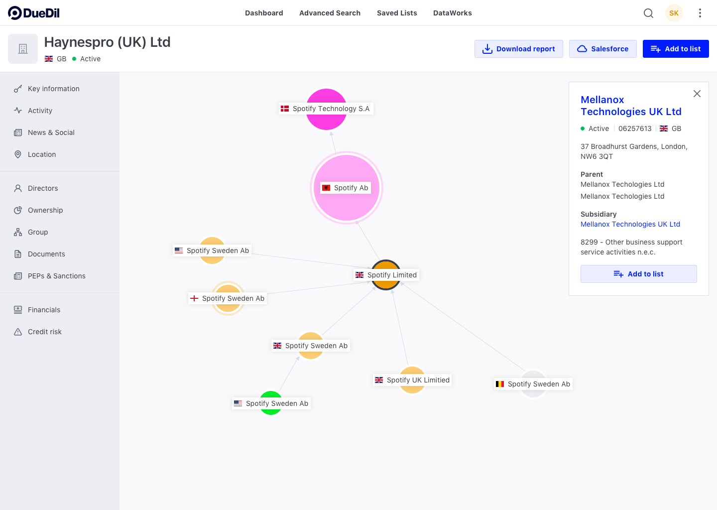
Above image: New group graph
Challenges
There were number of challenges throughout the process. The biggest issue was that our library symbols often broke out of it's pattern when there were major updates to Sketch or Abstract. This meant we had to go in and manually fix the symbols. We had hoped our Sketch Library, coupled with Storybook, would become our source of truth. But in the interim, we will be relying on our documentation, as a source of truth.
Above image: Abstract library
What next
DueDil Design System is a living system that will grow. It will continue to evolve, as new features are created, and business goals change.